Step-by-Step Guide
Overview: In this example, we will walk you through how to take one of the HexIQ Templates from our tutorial videos and adapt the formulas for your specific use case.
We will be using the excel sheet we set up in the Benchmarking Negotiated Medical Rates with a Pivot Table example to build off of. In that example we were looking at benchmarking rates for Covenant Health in Maine, but maybe you work for a different hospital system in NH and you want to take that layout and apply it so you can benchmark your own rates.
For the first step, login to https://my.pulse.app/medical or sign up to create an account.

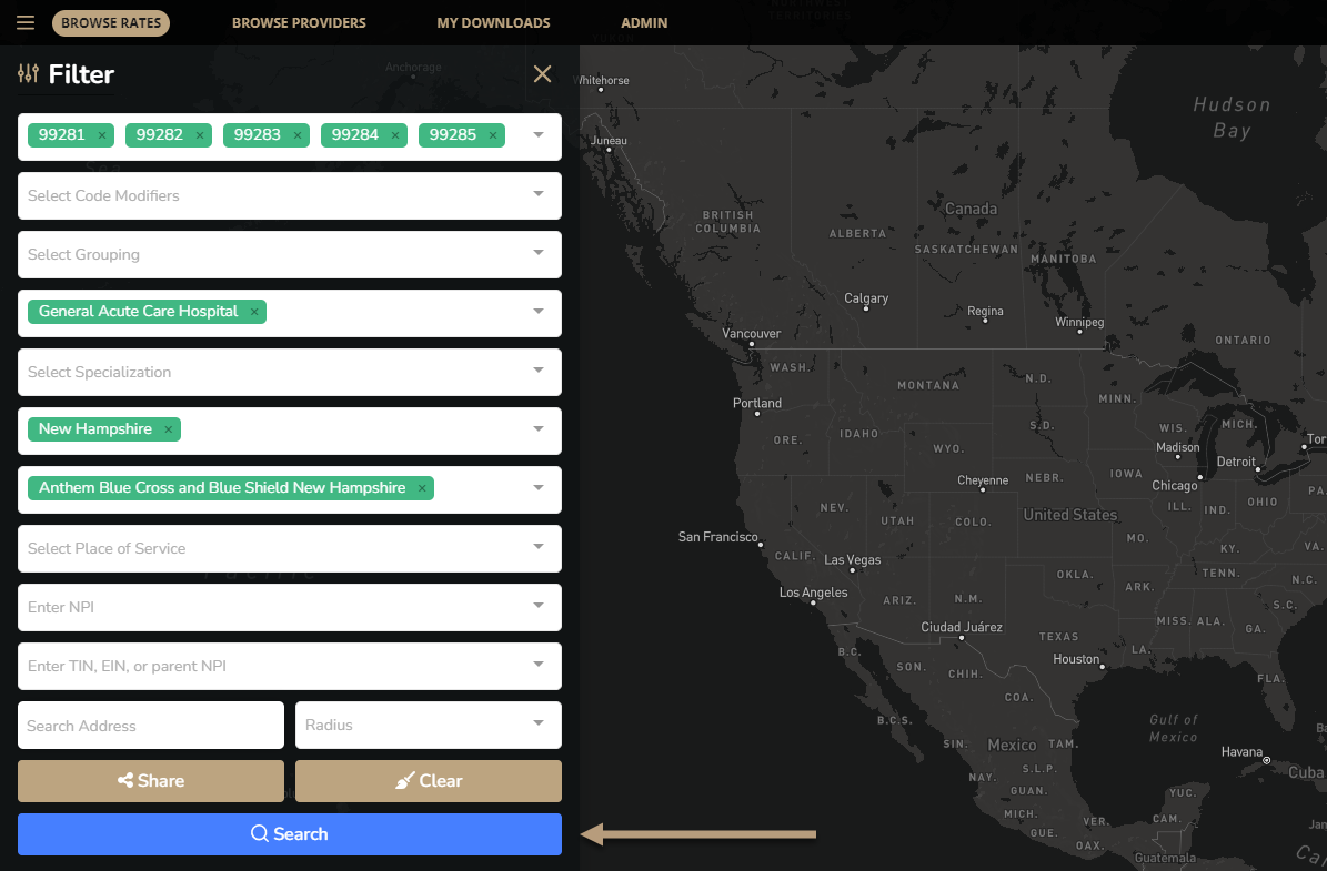
Enter rate numbers you are looking to compare. In this example we will use the same Emergency Room codes for General Acute Care Hospitals but this time we will get data for Hospitals in NH.
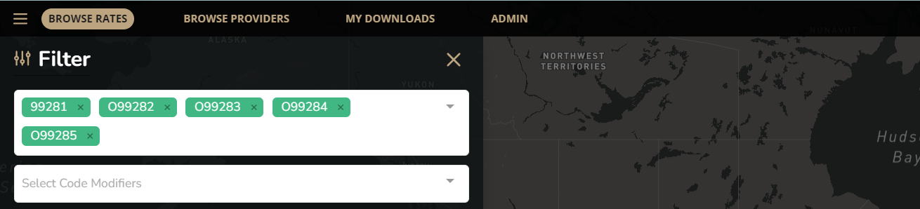
Add the other fields to complete your search
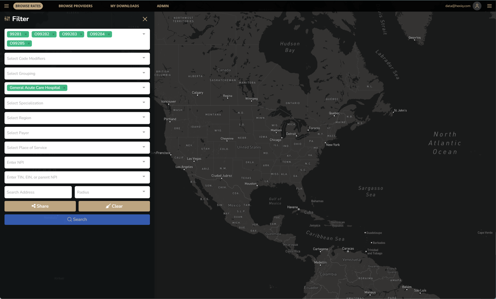

Once all criteria is added, click search.
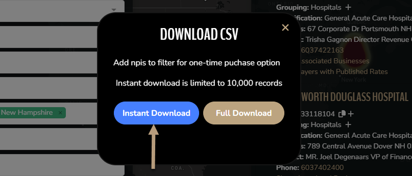
When the search results appear – click Download.

For this example we can use the instant download button.
Rename your worksheet and save as a new file.
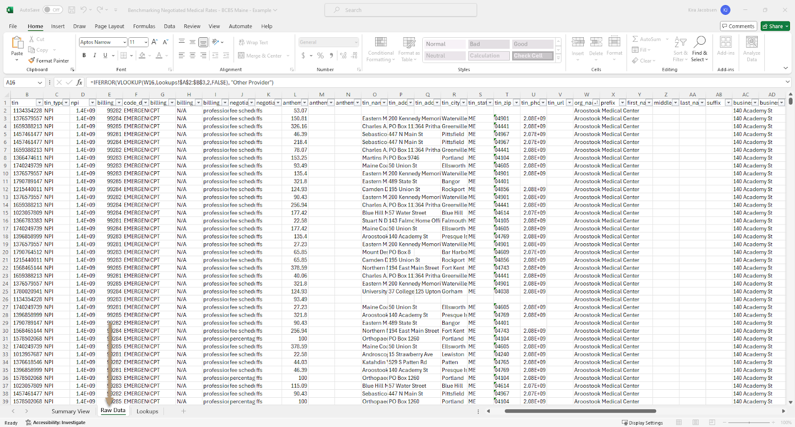
Next we will delete columns B through AZ which is where we will add in our raw data from our NH spreadsheet.
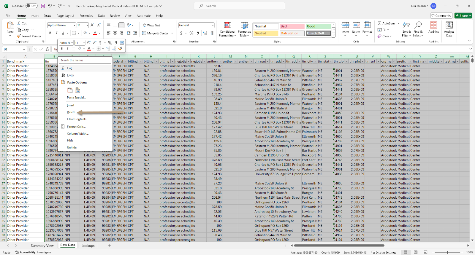
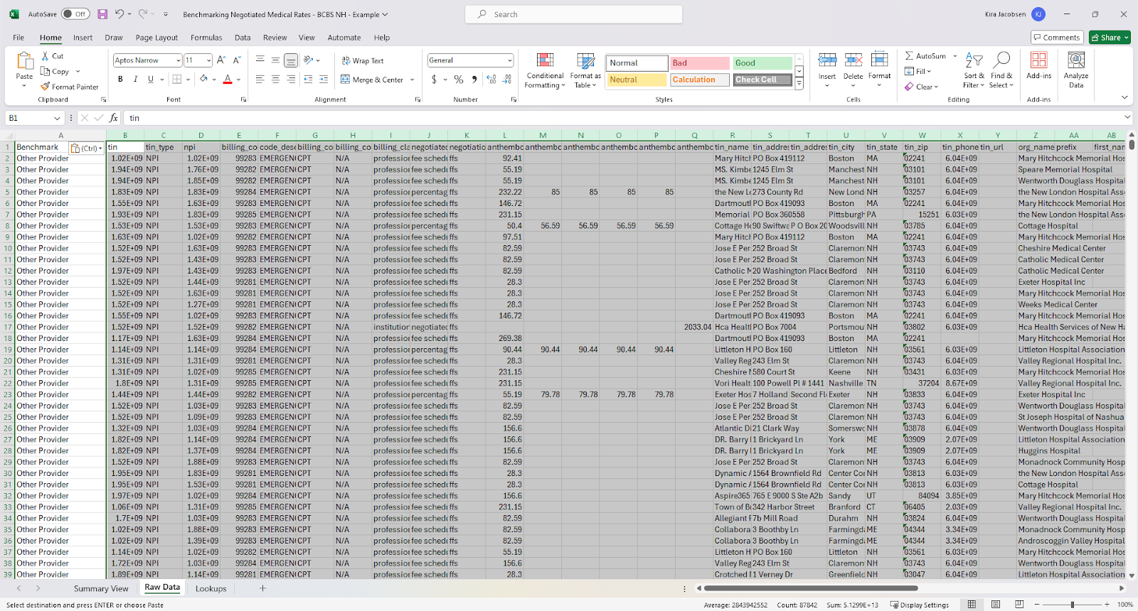
When those cells are cleared – open the HexIQ file with the NH data and copy it to paste into this other sheet.
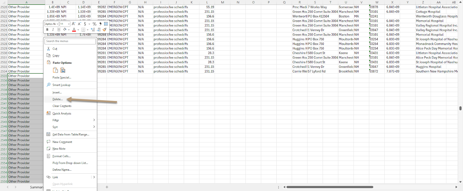
Scroll to the bottom of the spreadsheet and see if there are extra formula rows or if you need to extend the formula column A to match the number of entries you have for the new data. In this example we need to delete some extra formula rows to match the amount of new entries we are including.
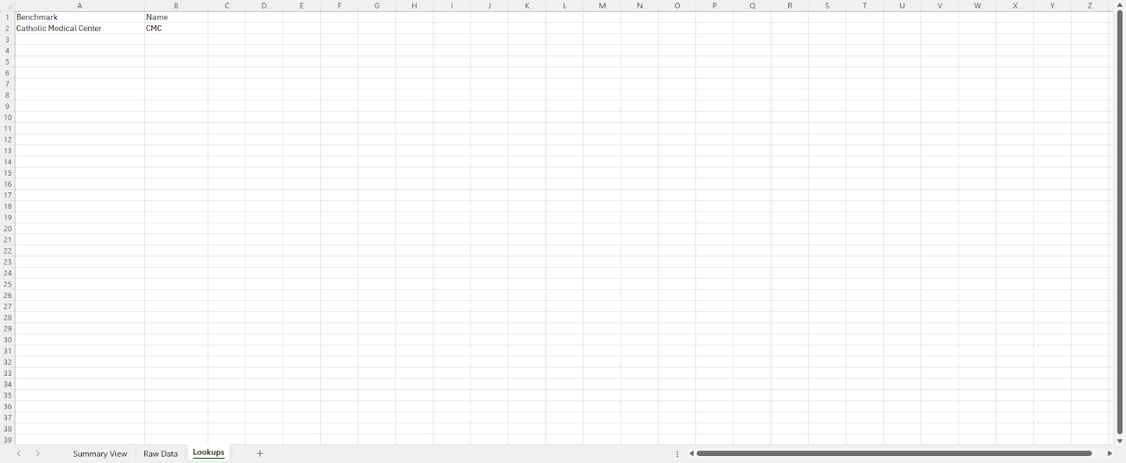
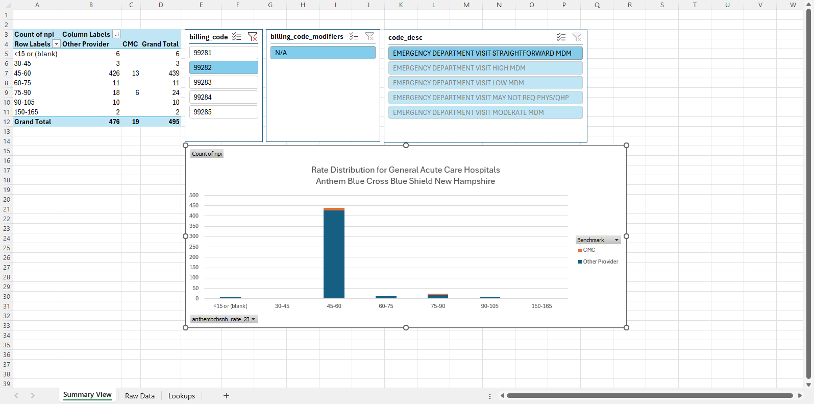
Once your data is set up we will update the Lookups spreadsheet and enter the details for the organization we want to benchmark. In this example we see how Catholic Medical Center ER visits rank.
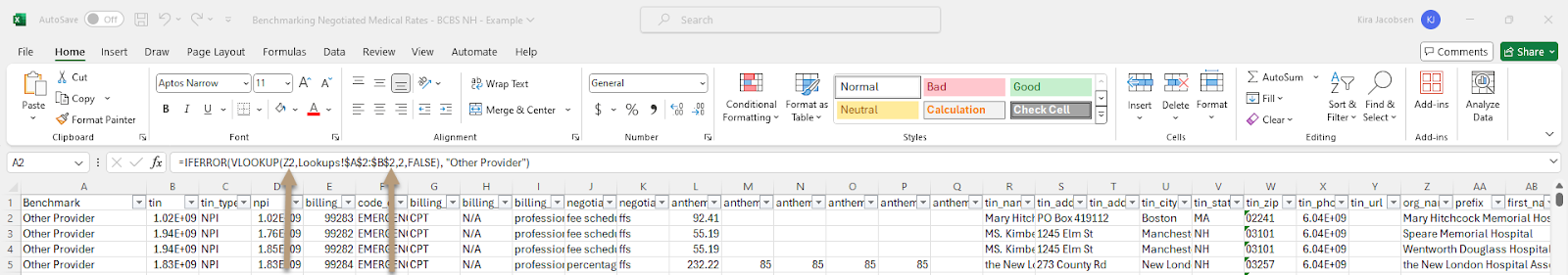
Once the Lookups sheet is updated, go back to the Raw Data tab and we can check to make sure our formula is updated so the range matches our updated table. We want to make sure the first value maps to the org_name column and the second absolute value is changed to $A$2:$B$2 since we only have one Hospital listed.
Next we will update the pivot table data source and tweak our chart a little.
On the summary View tab, click in the first column of the table so we can update the table range. On the PivotTable Analyze tab, click Change Data Source.
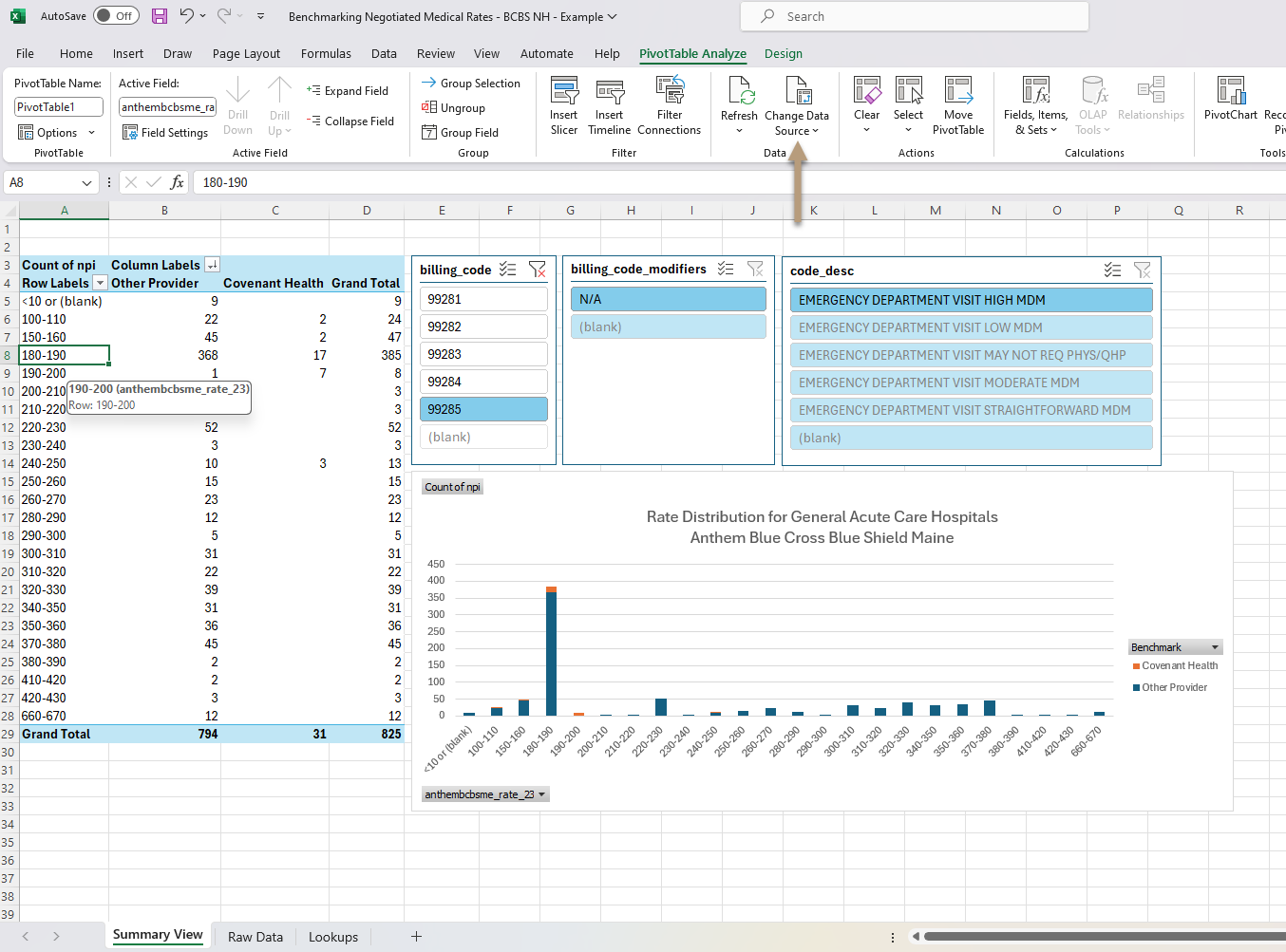
Select all rows in the Raw Data tab.

We also have to update the new rate name because the column name changed when we downloaded the new data set.
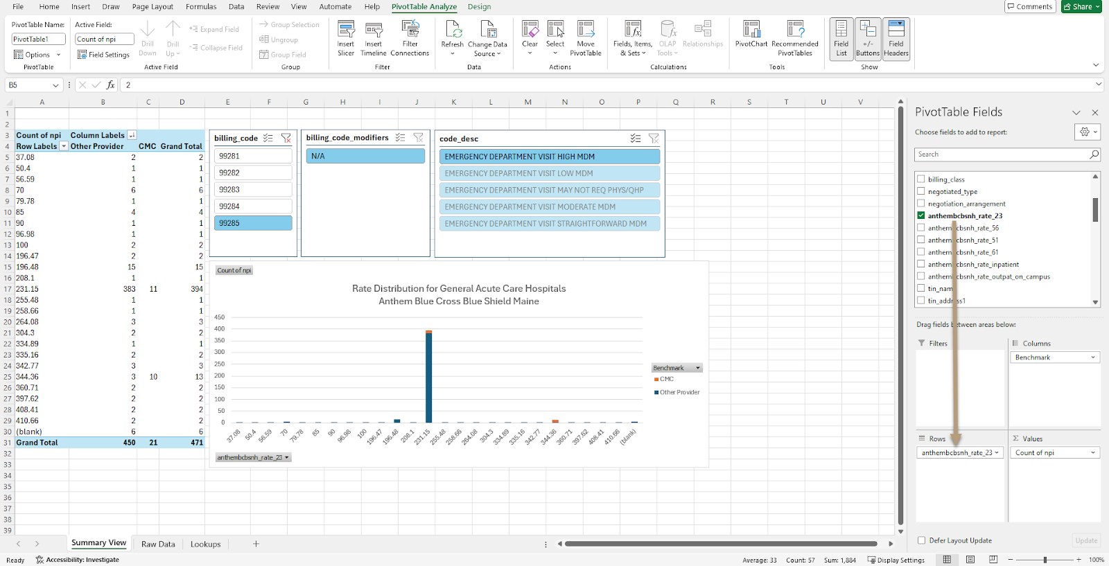
Next, we can reset our rate values to group ranges of rates together. Right click on one of the cells in the left column and click Group…
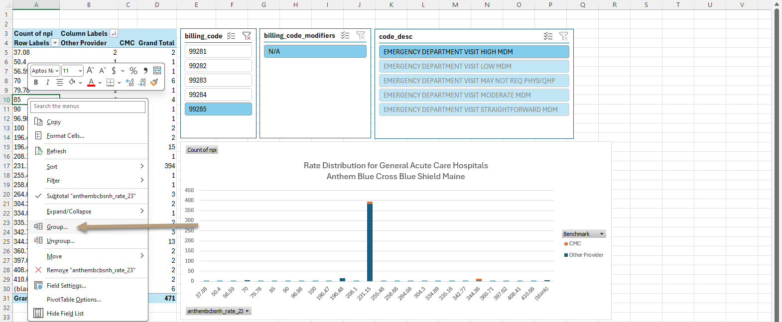
We will reset our low value to 15, our high value to 530 and our increments to 15, then click OK.

Click around the different billing codes and test that all the slicers are working as expected.
Update the chart title as a final step.
Follow along these same steps to update the template to show data for your specific use cases.


