Step-by-Step Guide
Overview: In this example, we are looking at emergency room rates for hospitals in Maine with United Healthcare. We will be showing how you can look at a rate distribution and also look at the benchmark for one specific organization.
Download the data we use in this benchmarking example HERE.
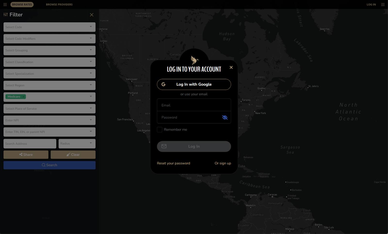
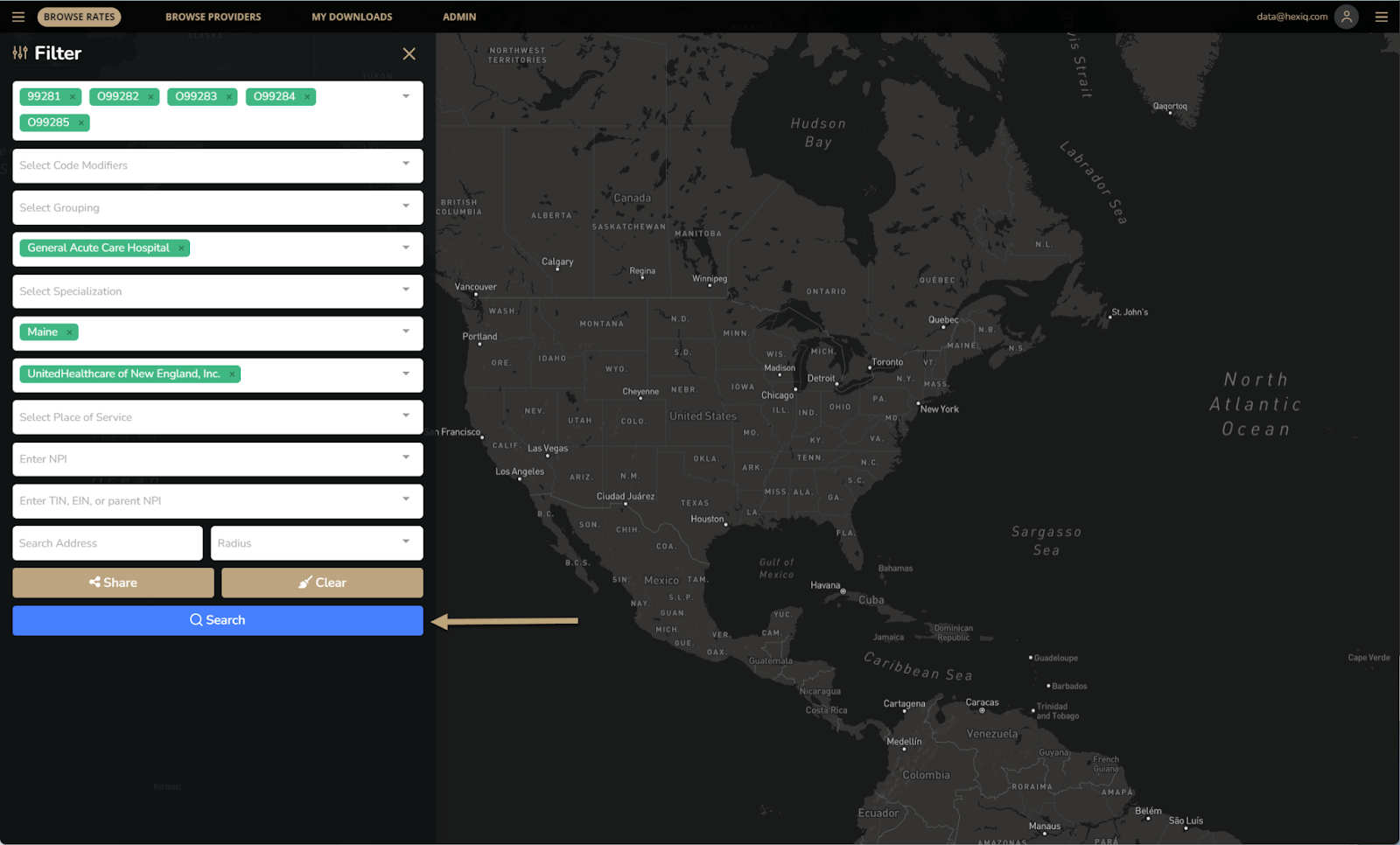
- Login to https://my.pulse.app/medical or sign up to create an account.
- Enter rate numbers you are looking to compare
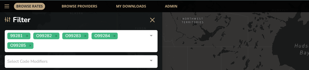
- Add the other fields to complete your search
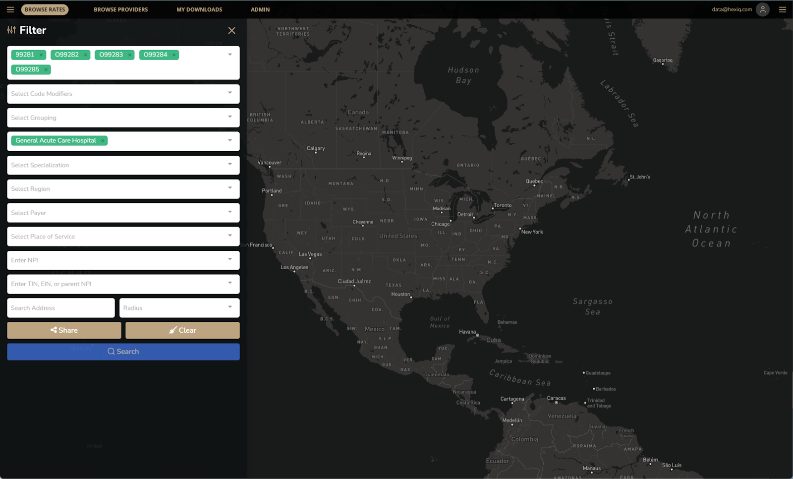
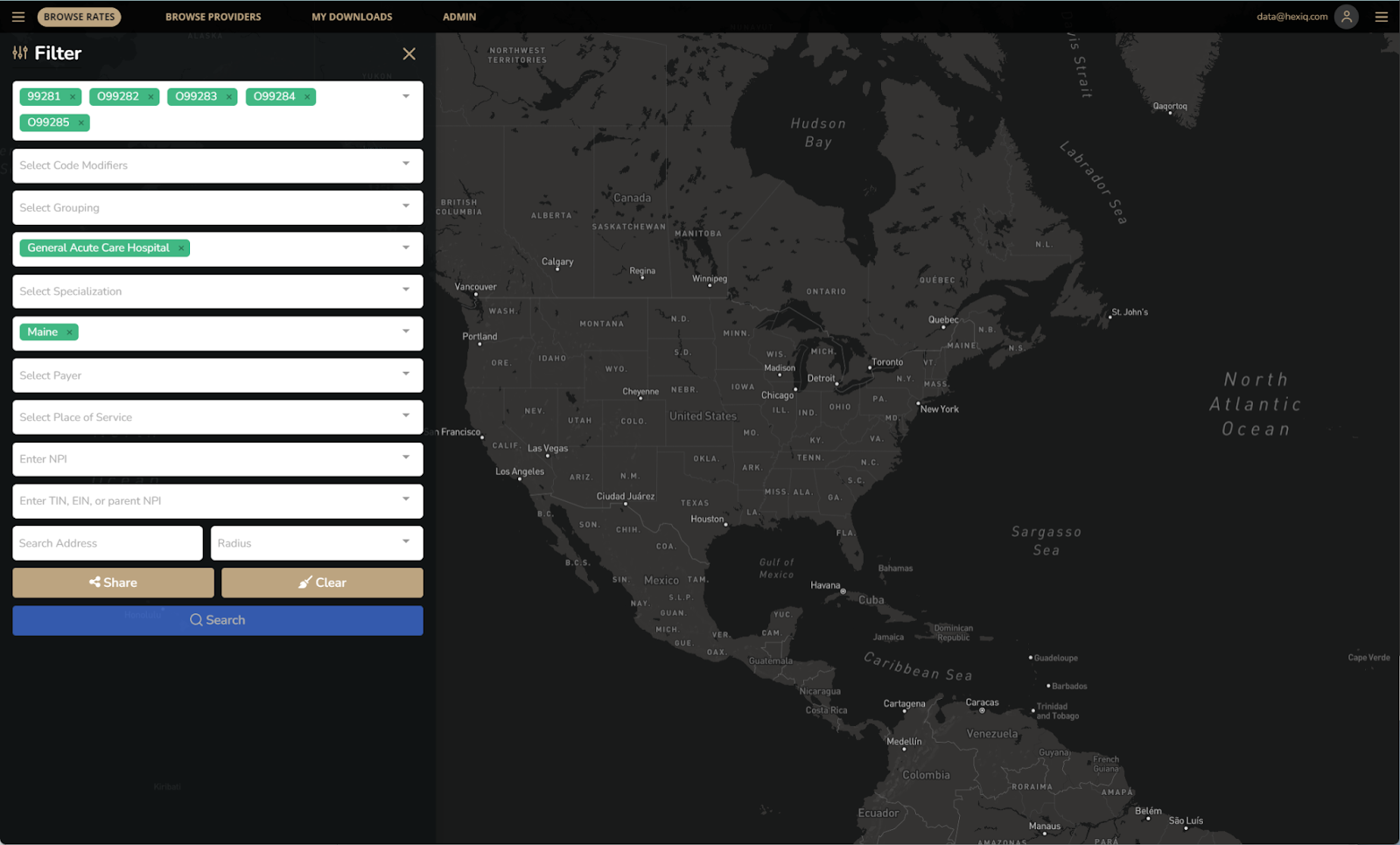

- Once all criteria is added, click Search.
- When the search results appear – click Download.
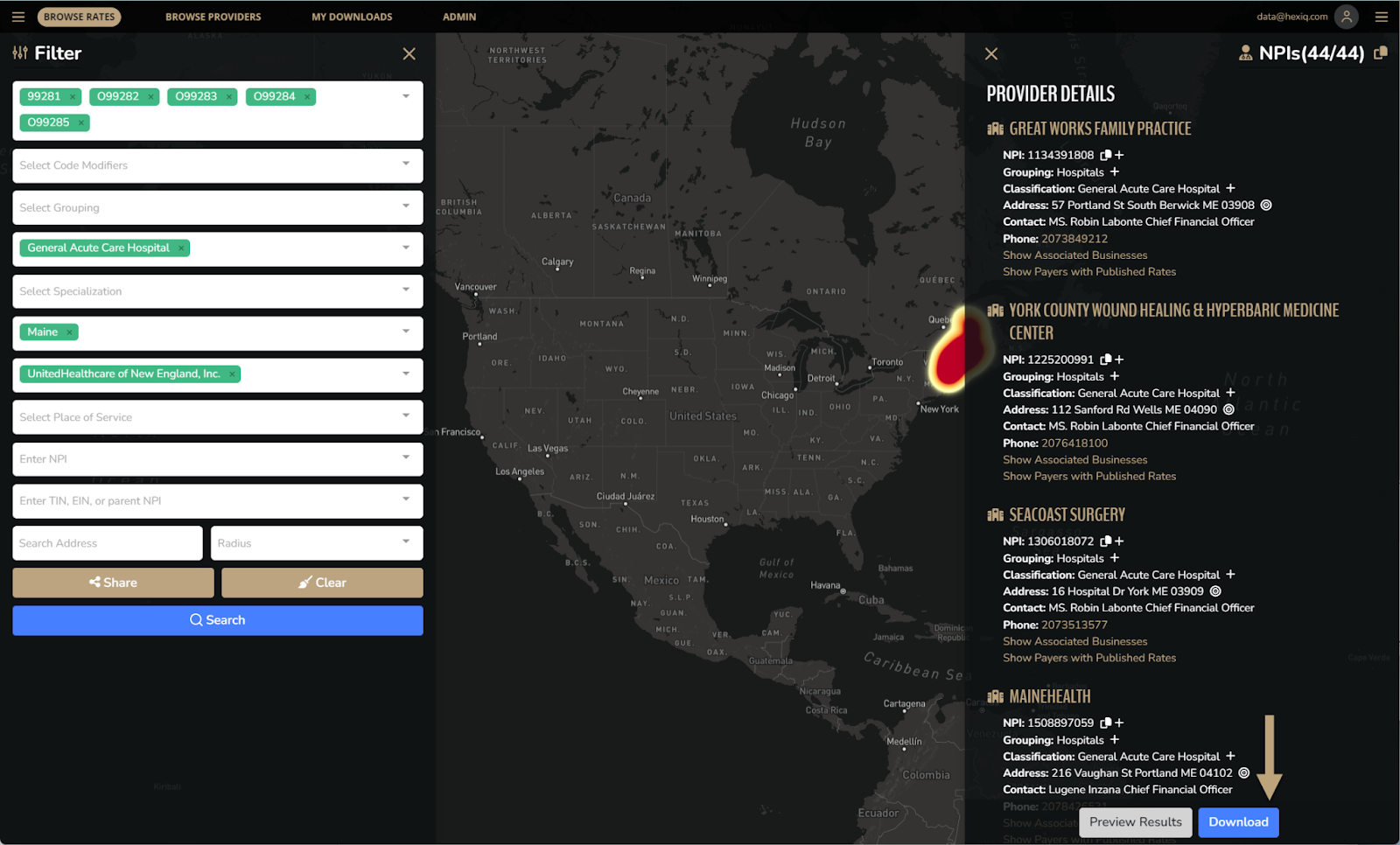
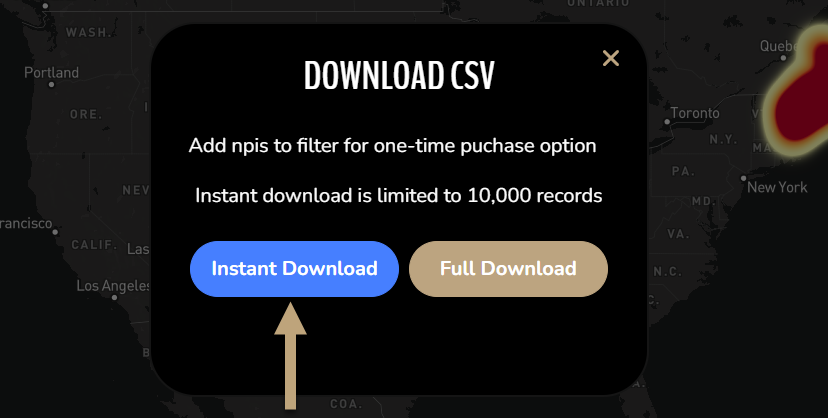
- For this example we will use the instant download.
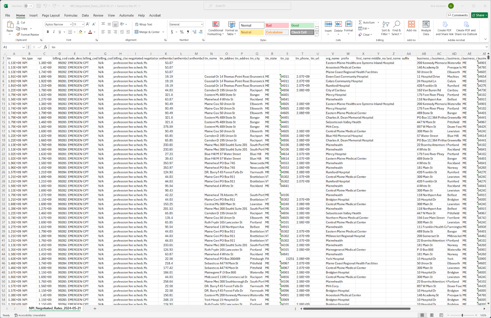
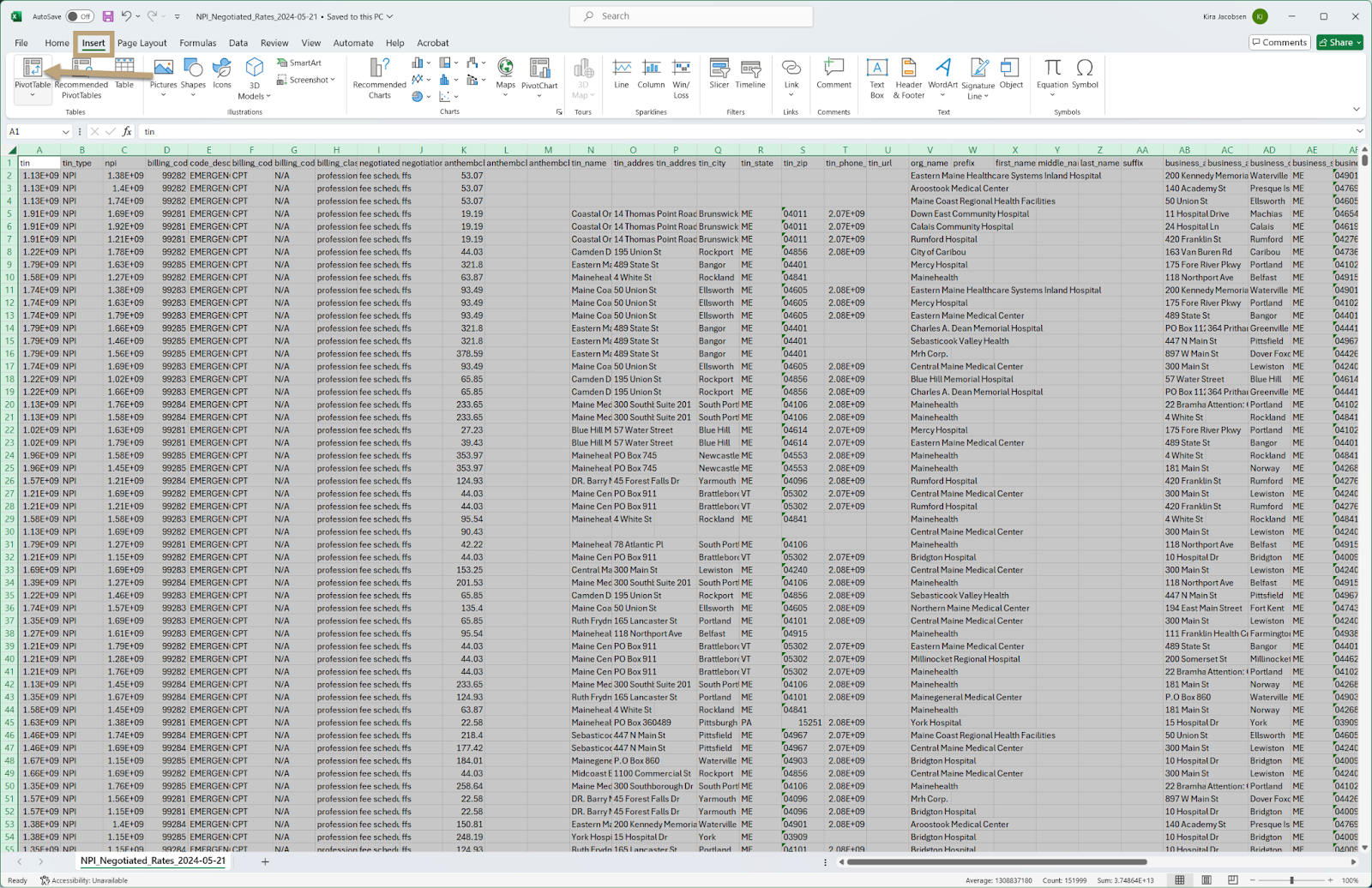
- Once the download is complete – open the spreadsheet in Excel
- Insert a Pivot Table by selecting the button from the insert tab.
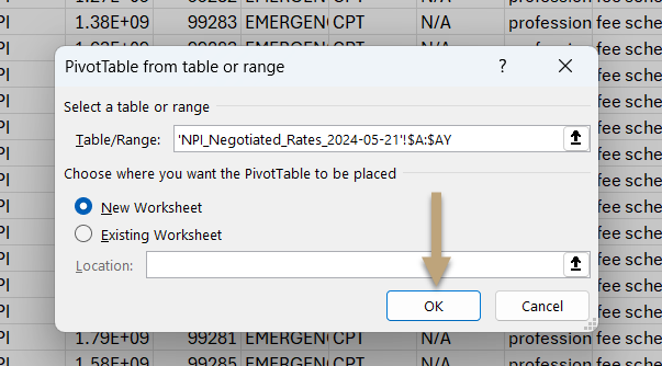
- Add the Pivot Table to a new worksheet and click OK.
- Right click to rename the tab to something that makes more sense – in this example we will rename this to “Summary View”
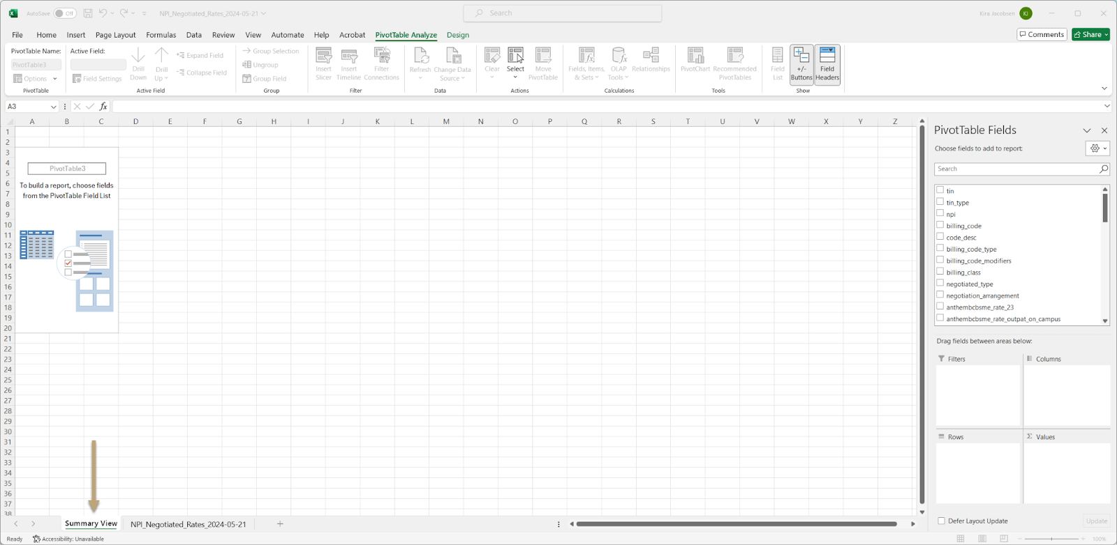
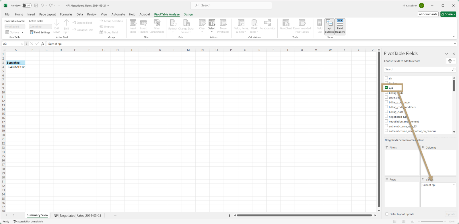
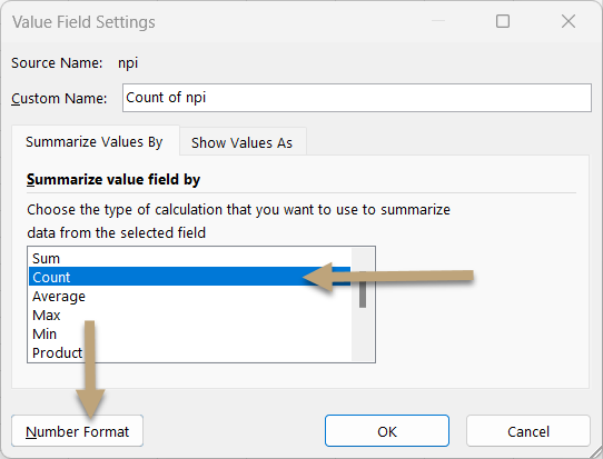
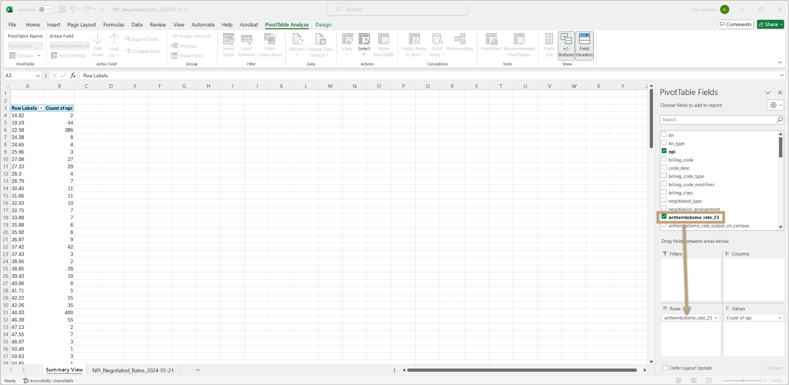
- Next we will pull down the NPI into the Value field of the Pivot Table
- Click on the Sum of npi and click on Value Field Settings

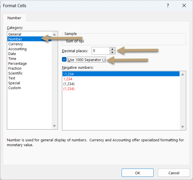
- Select Count and then click on the number Format button
- Adjust the formatting for the numbers in the spreadsheet and click OK on both windows.
- Next we will drag the service code into the Row section for the Pivot Table. This maps to Emergency Rooms.
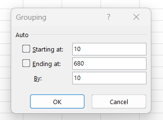
- Right click on one of the cells in Column A and click Group
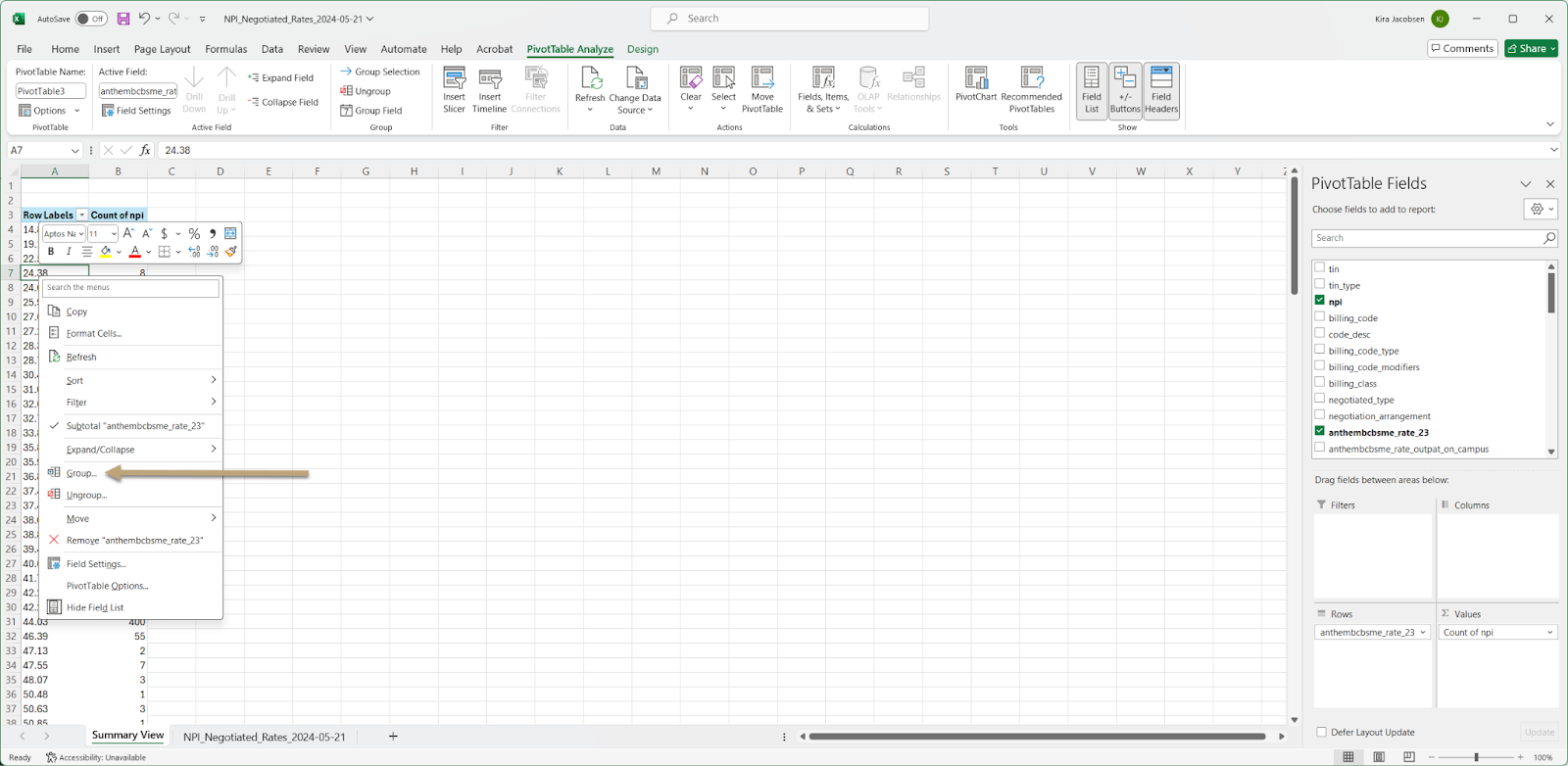
- We want to select something lower than the starting at and higher than the ending at numbers and set the interval amount in the By field. For this example let’s use 10, 680 and 10. Enter your grouping requirements and click OK.
- Next we can add some slicers so we can view one code at a time. Click Insert Slicer and select billing_code, code_desc, and billing_code_modifiers then click OK.
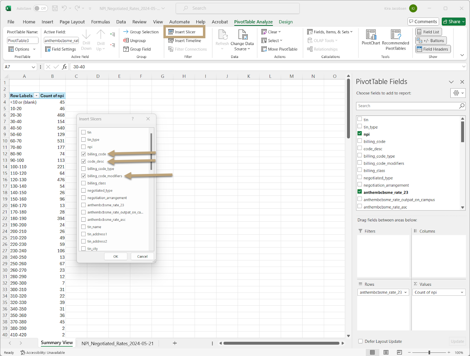
- Drag your slicers next to your table

- Select the rows of the table to add a char. Click on the Insert tab and then select stacked column from the 2-D section.

- Position your table and add a relevant title
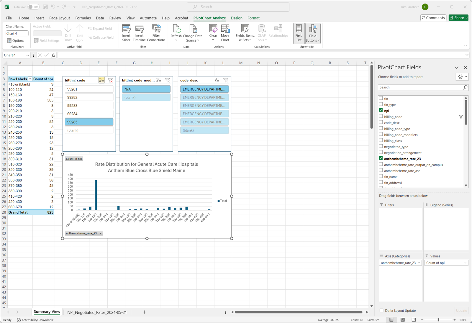
- You can then click through the different billing codes in the slicer and easily highlight the hospitals you want to benchmark
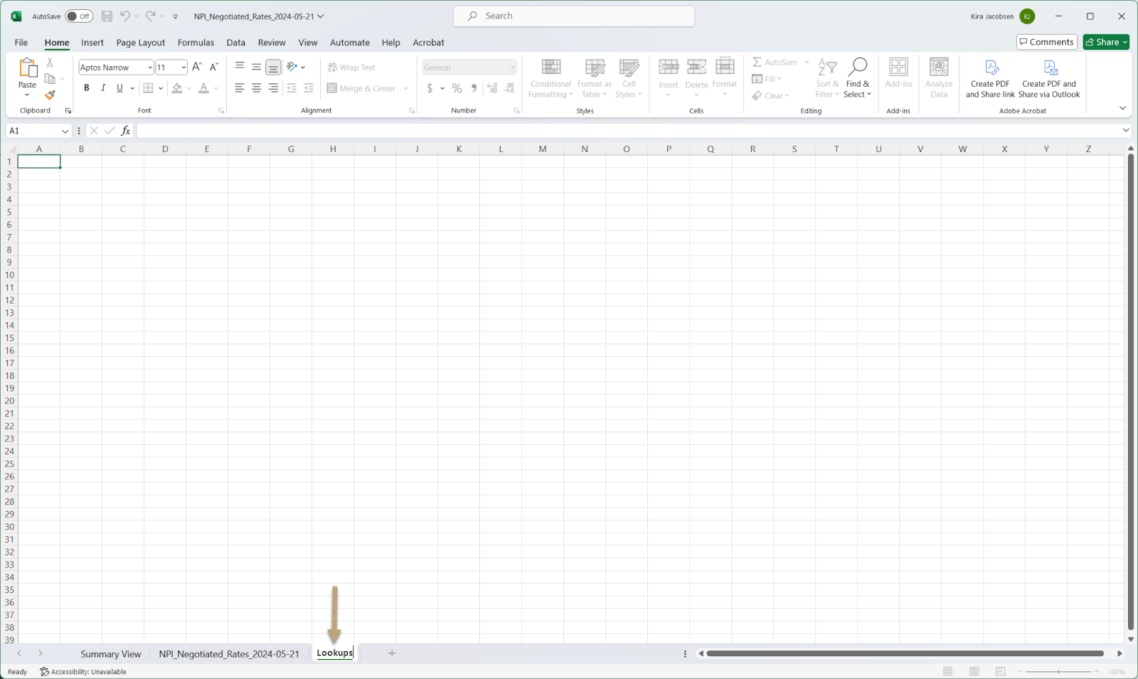
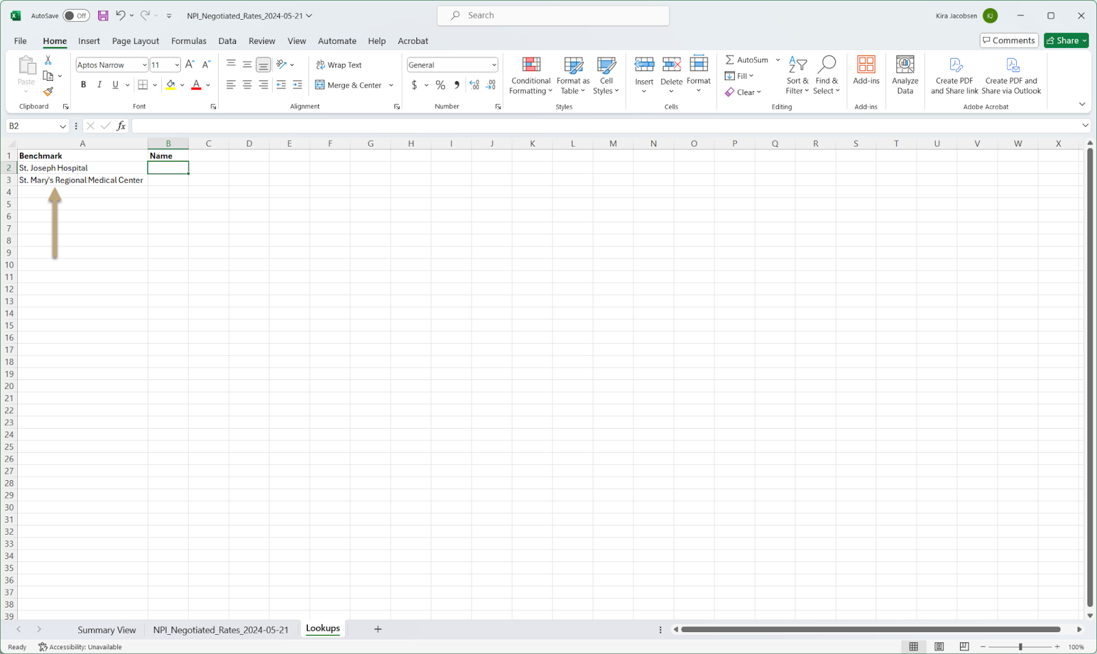
- If you want to dive into more specifics of a particular hospital we can do that using a lookup. Let’s add a new sheet to our document and rename it “Lookups”
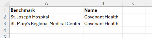
- In this example we will use St. Joseph Hospital and St. Mary’s Regional Medical Center. (You can also use the TIN number or NPI – whichever makes the most sense for your example.) First we will copy those two names under a new column titled Benchmark.
- Then we will add a Covenant Health label for both
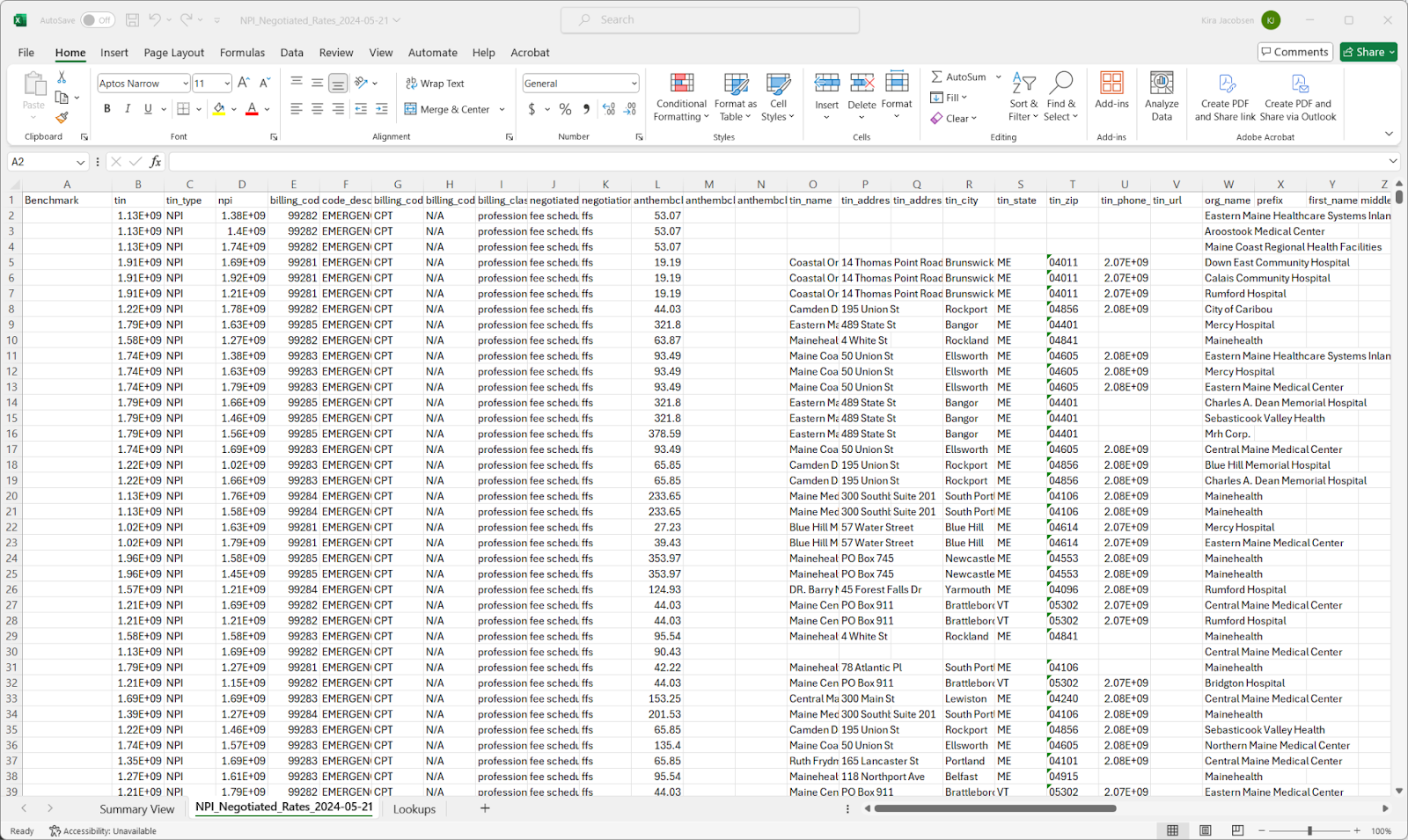
- On the NPI_Negotiated_Rates worksheet insert a column to the left.

- Add the Benchmark title to this new column
- In cell A2 add the following formula =IFERROR(VLOOKUP(W2,Lookups!$A$2:$B$3,2,FALSE),”Other Provider”) which sets the benchmark to Covenant Health or Other Provider depending on the data. Double click the right corner of the cell when your cursor shows the + sign to copy this formula to all cells in this column.

- We will then update our Pivot Table to include this new column. Click back to the Summary View worksheet and click in any row in the pivot table and click change data.
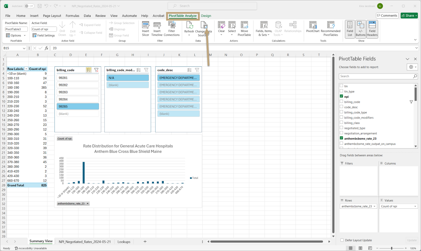
- We want to update this to include column A instead of starting at column B

- Now that our Benchmark Title is showing we can drag it to the columns section of the pivot table and you can see the table update to show a stacked column chart.

- You can change the sort order to view Covenant Health in orange and Other Providers in blue.
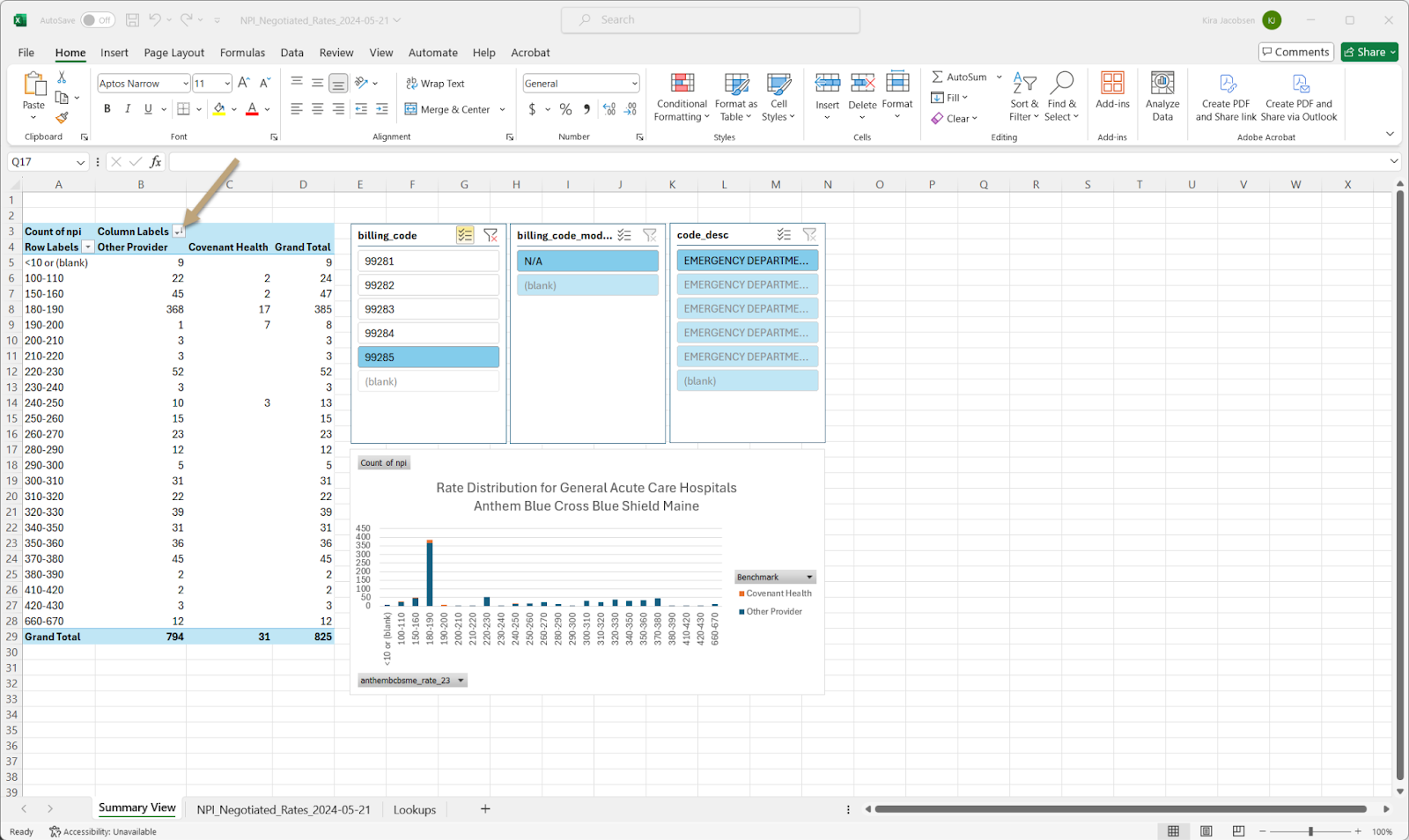
- You can now toggle between the CPT codes to see where Covenant Health falls in the range of negotiated rates for emergency room visits. Organizations that use this negotiated rate data will have a clear advantage when entering into a renegotiation with commercial payers.

Follow along by downloading the data we use in this benchmarking example HERE or book a demo with our team.


