As you work to build a data-driven business case for your upcoming rate renegotiation, it’s important to know how your current rates compare with other similar practices in your area. One effective tactic to consider is calculating the distribution of rates for your provider population for each of the codes you care about.
For example, let’s look at one Obstetrics & Gynecology practice in California that is entering a renegotiation cycle with United Healthcare.
First, we’ll start by analyzing the rates for standard 30-minute office visits with established patients (CPTⓇ code 99214). At the end of our analysis, we’ll have a distribution chart and some high-level statistics that look like this:

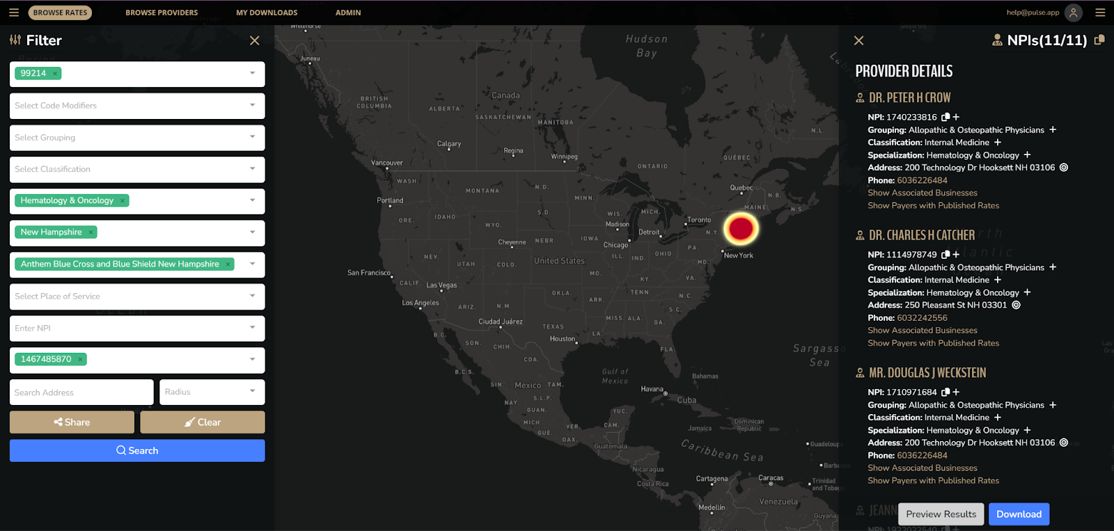
Find all the Tax Identification Numbers (TINs) your negotiated rates are published under for your payer of interest by doing a narrow search in Pulse Medical and downloading your results, focusing on one code at a time.
In our example, we’ll use the code for a 30-minute office visit with an established patient (99214) for New Hampshire Oncology-Hematology PA (TIN 1467485870) for Anthem Blue Cross Blue Shield New Hampshire.
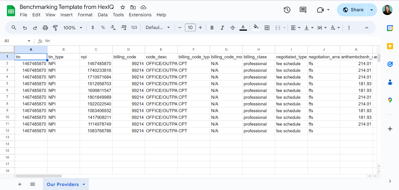
Save your CSV file as an Excel (.xlsx) file or paste the raw data for your practice into a new Google Sheets spreadsheet.
Rename the worksheet with your saved data to something more descriptive than the default worksheet name, such as “Our Providers.”
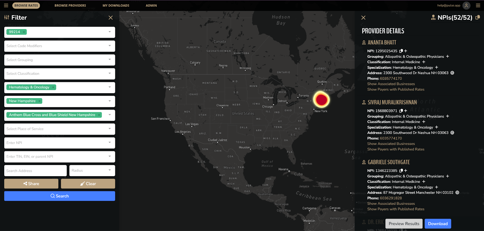
Download the rates for all the providers you want to benchmark against for your code of interest.
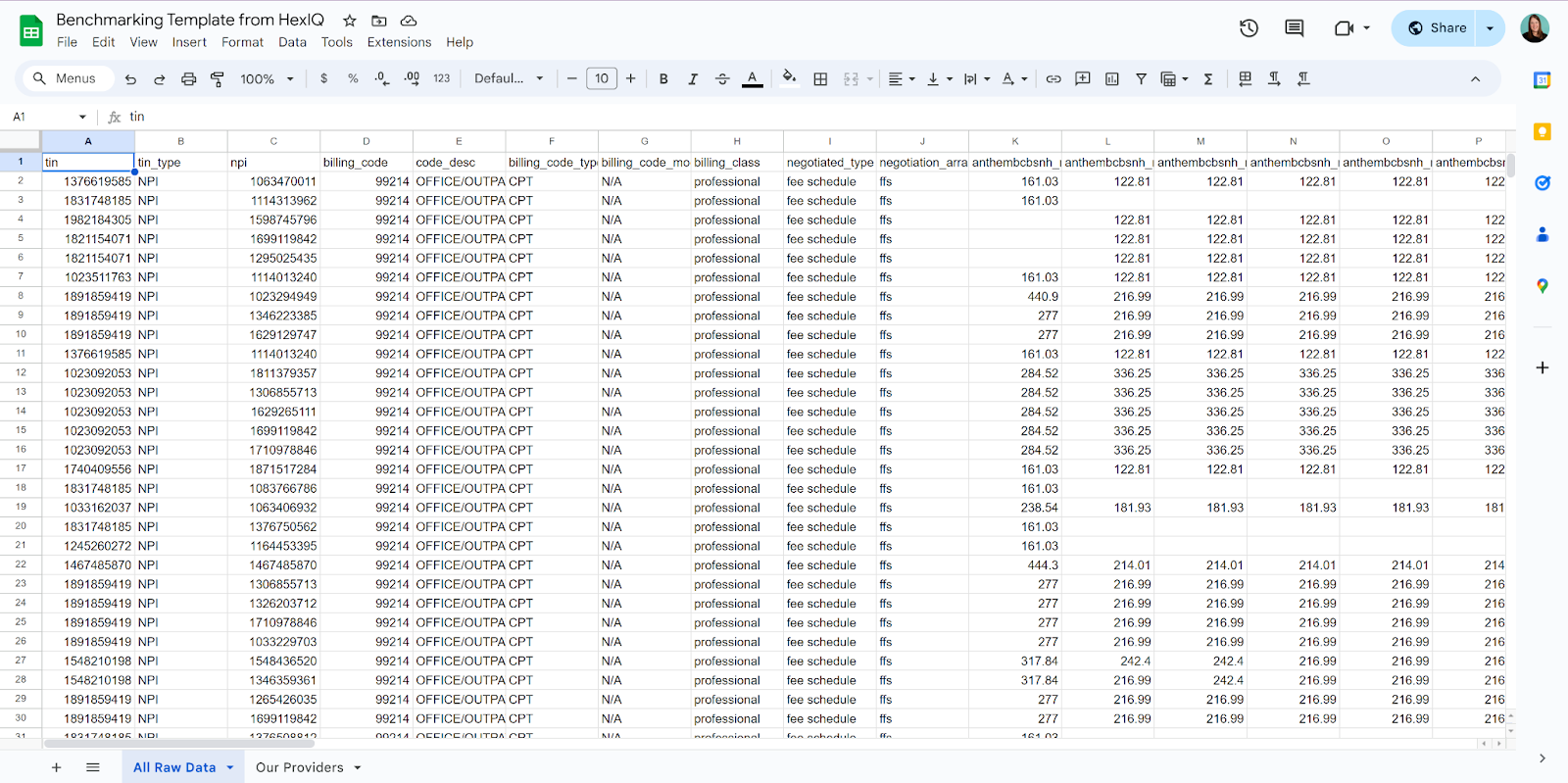
Create a new worksheet in your spreadsheet called “All Raw Data” and paste the downloaded data from the previous step into it.
Add a New Worksheet called “Summary Data”
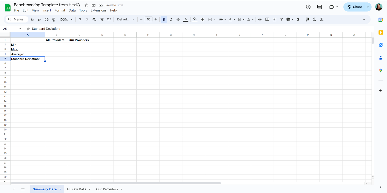
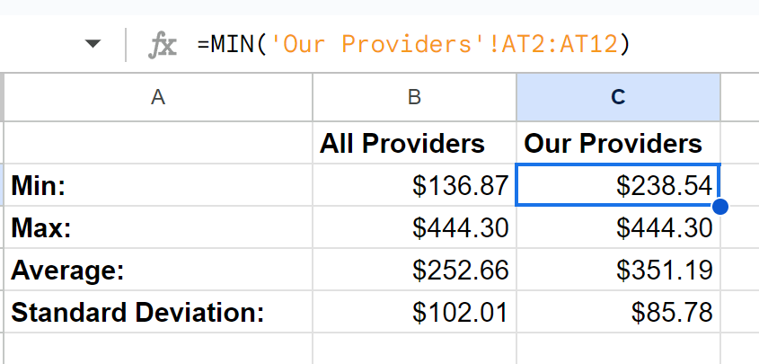
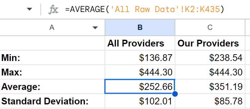
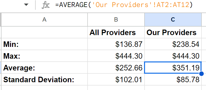
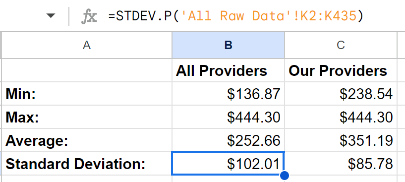
In this new “Summary Data” worksheet, add a table to show the Min, Max, Average, and Standard Deviation for All Providers and Our Providers.
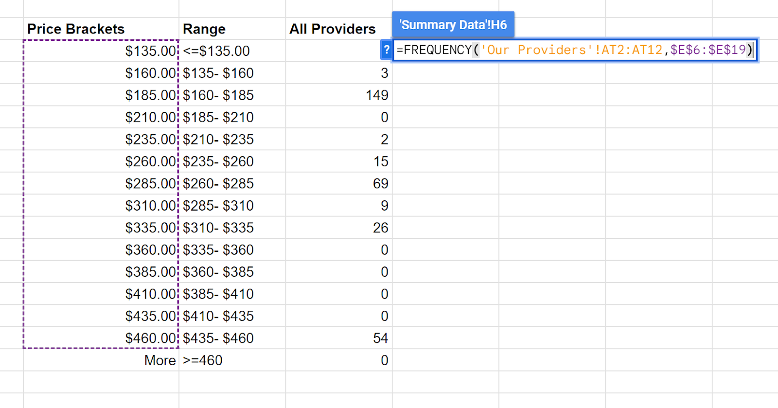
Make a note of the column in each worksheet that has the negotiated rate for the service setting for which you wish to benchmark your rate. In our example, we’ll use the office place of service (code 11), found in column K for “All Raw Data” and column AT for “Our Providers”
We’ll use the MIN, MAX, AVERAGE, and STDEV.P to calculate the appropriate values for each column.
Min will give us the smallest value for all of the rows.

Max will give us the largest value for all the rows.


Average will give us the mean for all the rows.
Standard Deviation of the Population will tell us how close together rates are.

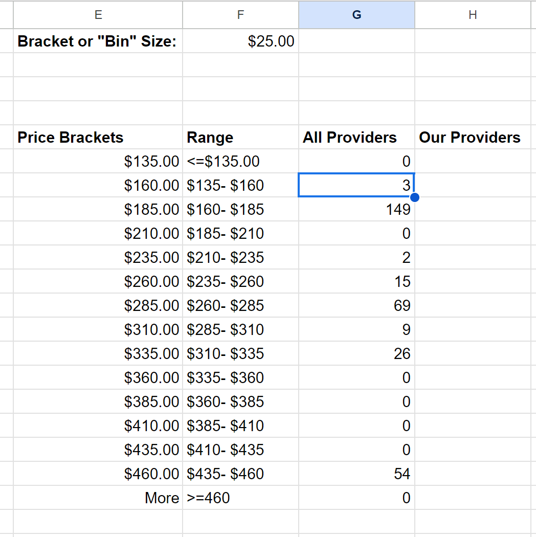
To create a distribution chart to visualize the variance between the rates for this code and various providers within this payer, we will need to break the rates out into ranges and count the number of providers that fall within each range.
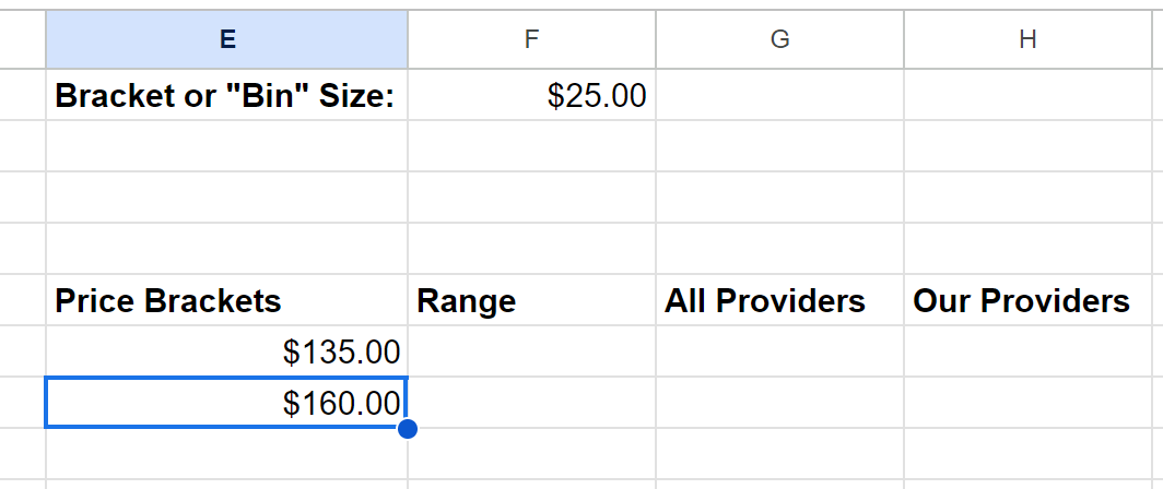
To do this, we’ll need to define what our “Bin” or “Bracket” size should be for each range. Depending on how large the standard deviation is (how much variance there is from provider to provider), you may want to choose $10-25 for your variance and see how the chart looks.
For our example, we’ll try $25.
Add this label / value to columns E and F in your “Summary Data” worksheet:

Add column headings below for Price Brackets, Range, All Providers, and Our Providers:

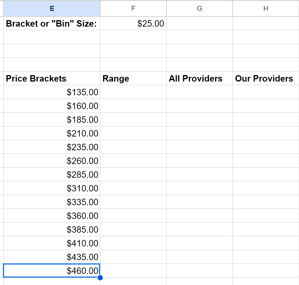
Set your first Price Bracket to be slightly lower than your Min value for All Providers. In our example, we’ll pick $135. Enter that value under your Price Bracket heading.

In the next row, we’ll start with a formula that will automatically calculate our bracket sizes by adding that first price bracket to our bracket / bin size in Cell F2. Make sure to hit F4 when you select the cell to make the reference absolute.
Copy this formula down for as many rows as it takes to get to a value that is just above the maximum value for All Providers.
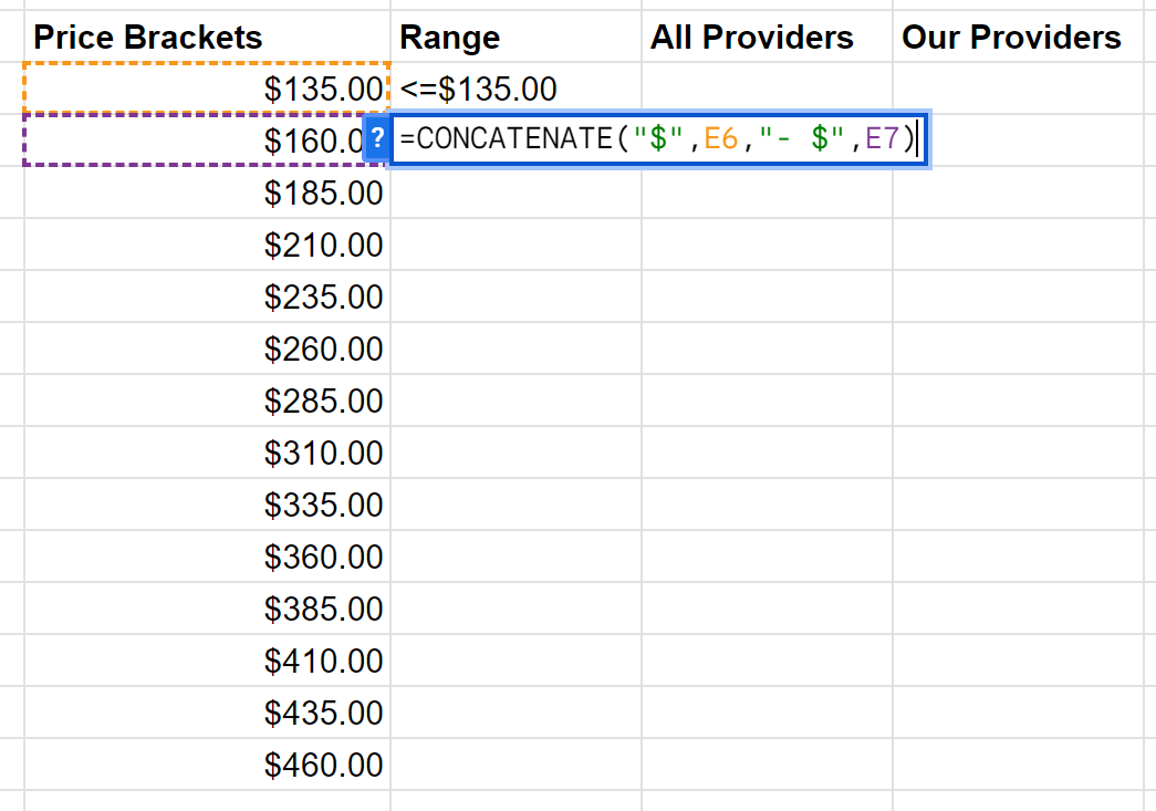
For the first value under the Range heading, manually add less than or equal to that first price bracket (in our example, it would be “<=$135”).
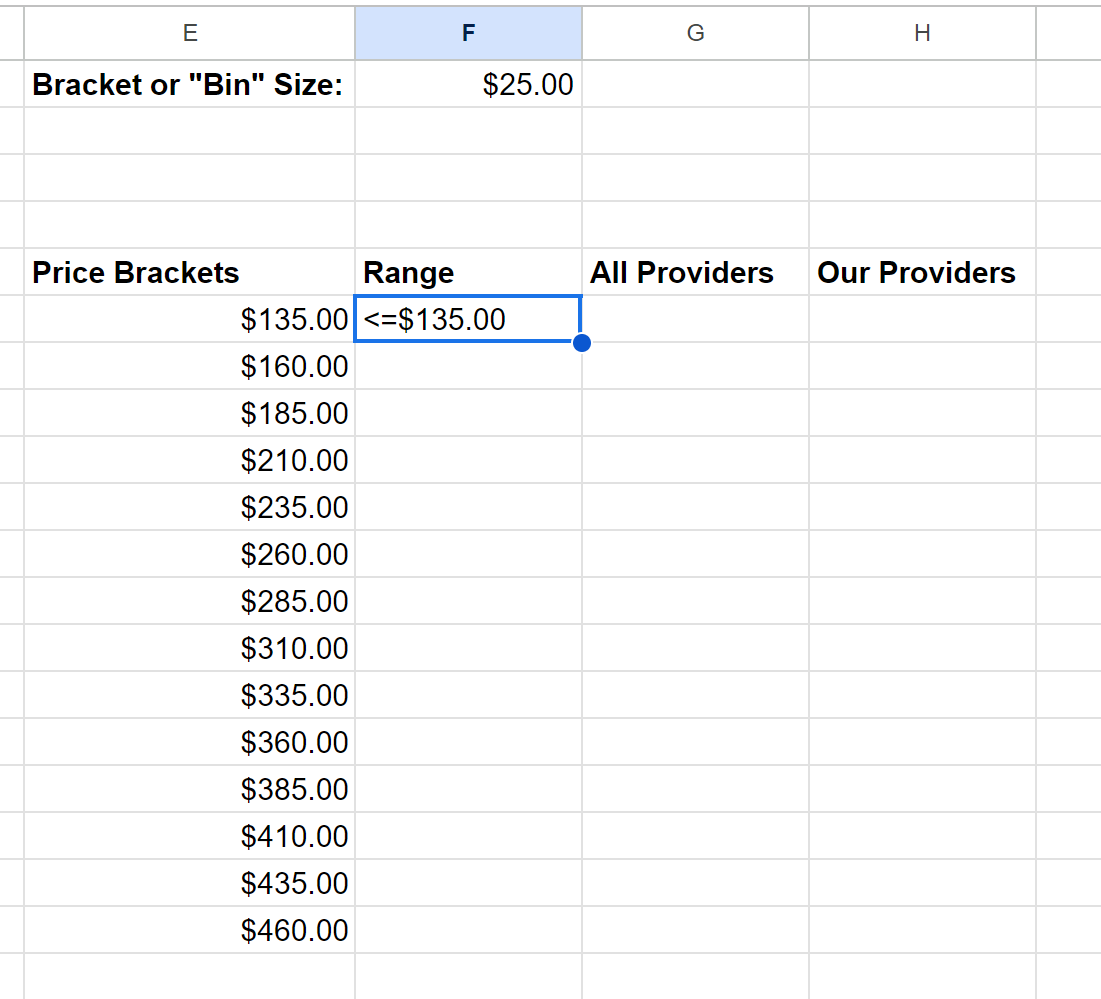
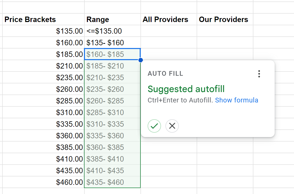
In the fields that follow, manually concatenate the two previous values using the text you’d like to see on the bottom axis of your final chart:
Copy this formula all the way through to your last relevant row.
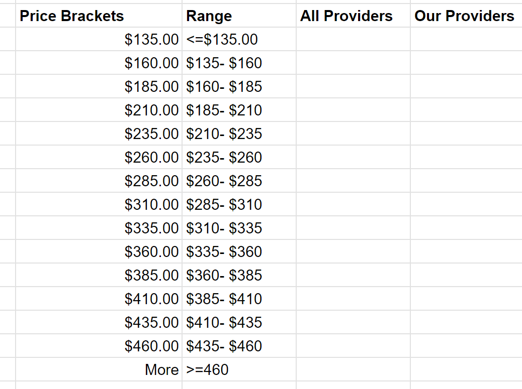
Underneath your last row, add >= your last value:

Now, we are going to calculate the frequency at which providers have rates within each of these brackets using the FREQUENCY function against data for All Providers and Our Providers.
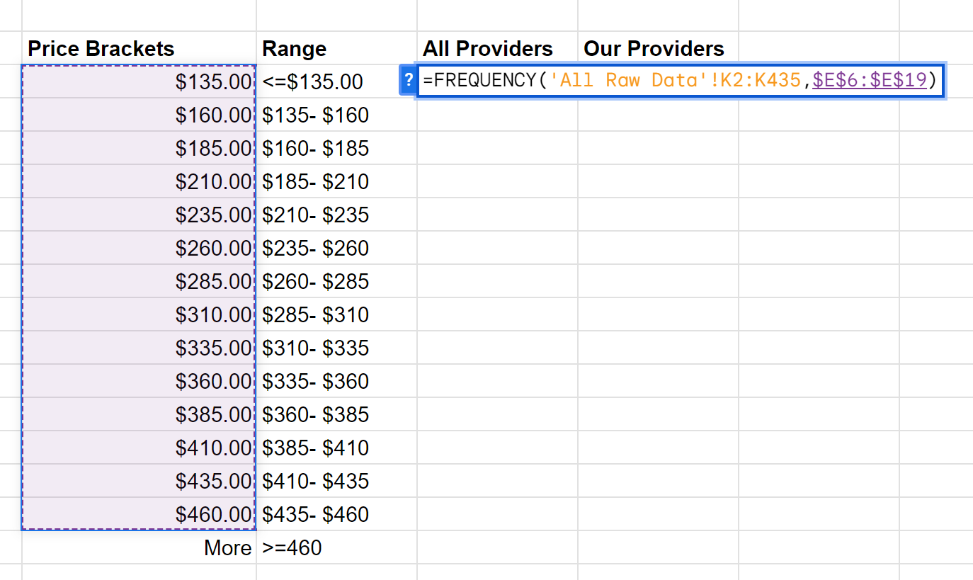
FREQUENCY takes two arguments: The source data you’re analyzing and the brackets or classes that you want to categorize them into.

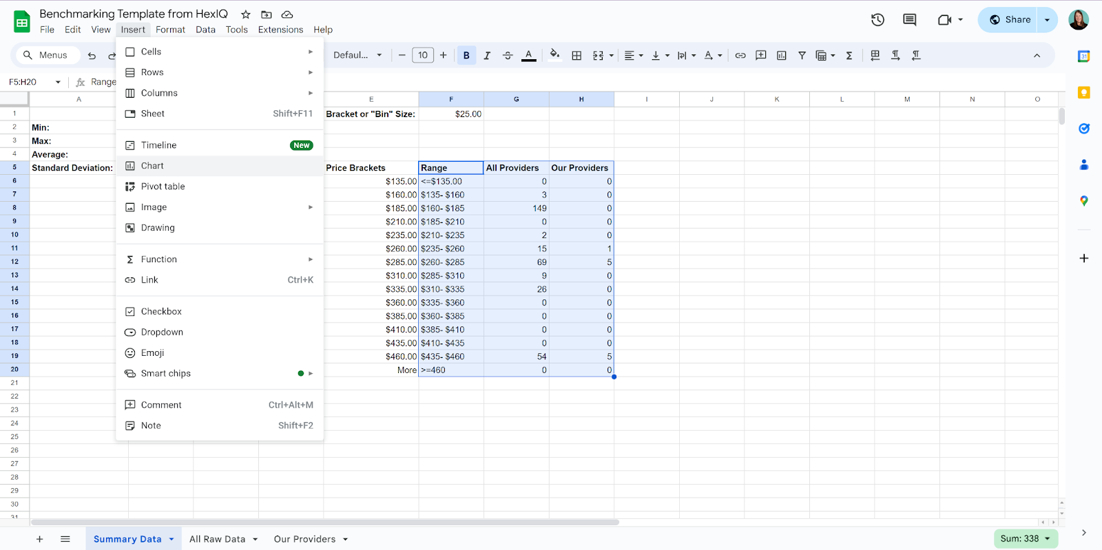
Now, we can visualize this distribution by highlighting the Range, All Providers, and Our Providers columns and choosing to Insert a Chart.
Here is a Google Sheet template you can “save as a copy” to use as a starting point for calculating the distribution for your rates.


